"In comics you make the strip come alive by reading it, by experiencing it beat by beat as you would playing music. So that's one way to aesthetically experience comics." -Chris Ware, via Raeburn, via Bredehoft.
Reading for the first time through Adrian Tomine's "Sleepwalk (and other stories)" I was struck by the effect of the story's rhythm. I observed that Tomine's pacing was so regular and linear: each panel was like a beat. First this happened, then this, then this, then this, then the end. This pacing seemed almost metronomic: so deliberate and measured, with events flowing easily and methodically along a very pronounced and regular narrative arc.
So how does Tomine achieve this effect formally?
One of the major factors that helps him to accomplish this is simply the regularity of his page. With the exception of his title pages, Tomine uses somewhere between four and twelve panels per page for the entirety of his book, and every last panel is rectangular. There is an even greater uniformity of form and structure within individual stories from "Sleepwalk"; 'Long Distance' (23-24) is two pages of four panels each, and 'Drop', on the following page, is only a single four-panel page. 'Echo Ave' (18-22) begins with a seven-panel title page and concludes with a ten-panel page, but the interior pages are all twelve-panel pages of exactly the same style. This rigidity actually serves to facilitate a receding of form into the background, the nondescript panels and gutters becoming an unnoticed backdrop to the facet of tomine's work that truly takes center stage: the stories themselves.
Tomine reduces any remaining chance of confusion for the reader with his proliferation of text boxes. Readers unfamiliar with the graphic novel will be right at home as the narrative stretches out through offset text boxes at the tops and bottoms of panels. There's no iconic arrangement to puzzle out in order to follow the plot, here. Tomine seems to want to make traversing the format as effortless as possible for us, so that our time is spent with his content instead of his form. The process of closure that Scott McCloud talks about in "Understanding Comics" is as basic and simple as possible, here, with most of these "interims" easy to fill in and supposedly uneventful.
Naturally, the next question I explored was how time and pacing were handled in the other graphic novel I was reading at the same time, (Well, not literally the same, as that would have been quite difficult, but the reading of one was interspersed with the reading of the other. Come on, people. You get it.) the critically-acclaimed graphic novel by Chris Ware, "Jimmy Corrigan: the Smartest Kid on Earth." It was clear that the pacing of "Corrigan" was very different from that of "Sleepwalk," but how?
I observed that "Corrigan" is a much more difficult text to navigate. Here, narratives are filed away inside one another. There are sudden leaps back and forth in time between the story of the main protagonist, Jimmy, and his grandfather of the same name. If Tomine's steady beat was your favorite song, easy to hum along with and tap your foot to, then Corrigan is the bizarre jazz fusion band your backward cousin likes that he listens to in the car on the way downtown to buy drugs. Ware's pacing can occasionally be just as moment-to-moment as Tomine's, but other times the same moment may be repeated, only with a different gaze, or there may be great leaps in time from panel to panel, producing a frenetic pace. Occasionally, the panels may not even be connected along linear time, but only related thematically.
So, as expected, is Ware's pacing so difficult because of formal aspects much different than Tomine's?
To some extent, yes. The panels and gutters in "Jimmy Corrigan" are actually as regular and rectangular as anything from "Sleepwalk." In fact, the regularity of the lines is even more precise. But there are exceptions, and when there are exceptions, they are massive. Thomas Bredehoft describes an early one in his essay "Comics Architecture, Multidimensionality, and Time: Chris ware's Jimmy Corrigan: the Smartest Kid on Earth":
"[T]he more-or-less conventional sequence of panels and pages that the book presents to its readers is interrupted by a page that shows a series of cut-outs: complicated shapes that can be literally cut from the pages of the book and assembled into a working zoetrope, a cylinder with a series of images on the inside (visible from the outside through vertical slits) that can be seen as a moving picture when the cylinder spins" (869)
There is also a page with cut-outs of a house, and a page that seems to be comprised of collectible cards of an urban landscape, with each picture having an accompanying description on the reverse page describing the historic or cultural significance of the bleak and nondescript property. These pages eject us from the narrative briefly and force us to recontextualize our reading experience.
Bredehoft also writes of an early page in which "At least four narrative lines, then, are clearly indicated [. . .]: the timeless narration of place—which takes us from the cityscape to the photo in Jimmy's drawer to the depiction of the photo as torn, with one half in the frame and the other in the dump—and the three time-lines that show the lives of Jimmy, his mother, and his father" (878). This page contains an anomalous 45-52 panels, depending on how one wants to define "panel", as some panels overlap one another or fit inside one another. Certainly, this sort of formal approach complicates and slows the reader's process, but by doing so Ware manages to control the pace much in the same way Tomine does. Ware is forcing us to spend time with thematic elements which we may gloss over, left to our own devices.
Ultimately, I am impressed by how both Tomine and Ware manage to control and manage their pacing in a way most suitable to their respective works. I may have more to say later about signifiers, transitioning, and closure, but that's all still percolating a bit.
Wednesday, September 23, 2009
Friday, September 18, 2009
McKean and "Sandman"

What is the significance of McKean's cover art in "Sandman"
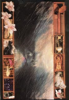
Of all the bizarre imagery in the first volume of Neil Gaiman's "Sandman" imprint, entitled "Preludes and Nocturnes," the most striking visuals in my opinion are the fantastic cover art pieces created by Dave McKean. Of course, there is a practical reason that the art is so different: McKean is more of a traditional artist than a comic book artist, having worked in film, photography, and design, but the covers he has created resonate with the comic medium while still providing unique representations of Lucifer, Dream, and other characters from the comic. the little shadowboxes that line the edges of the pages form a sort of paneling that mirrors the comic while still providing something much more abstract and realistic. The use of shadowboxes is interesting because the medium in a way echoes the themes of darkness and shadow in the graphic novel and is reminiscent of the dark palette which regularly surrounds the protagonist throughout the story.
What is the significance of the artifacts, relics, trinkets, and other objects located in the shadowboxes in McKean's covers for "Sandman"?
The use of these abstract objects, often unexplained or even difficult to identify, deepens the sense of the mysterious that is found in the series and also serves to locate this sense of mystery within the object. Tying significance to objects is a theme found in the first six issues of Gaiman's "Sandman," which the protagonist Dream spends trying to recollect the artifacts of his office, which are laden with both symbolic power and a very tangible, "actual" power as well. The plot teaches us to regard these sorts of objects (a mask, a pouch of sand, a jewel) with suspicion, interest, and wariness, and we are thus invited by McKean to regard the objects in his illustrations in the same way.

In the chapter "A Hope in Hell" for instance, the shadowboxes are filled with burnt and charred pages that appear to come from either Milton's "Paradise Lost" or Dante's "Divine Comedy," both classic pieces of literature which describe a descent into Hell. That the pages are burnt evokes the power of Hell so evident in the chapter, the memory of fire without actually visually showing the fire itself. McKean does a fantastic job of capturing that sense of the ominous which the reader encounters regularly throughout "Preludes and Nocturnes".

In the chapter "A Hope in Hell" for instance, the shadowboxes are filled with burnt and charred pages that appear to come from either Milton's "Paradise Lost" or Dante's "Divine Comedy," both classic pieces of literature which describe a descent into Hell. That the pages are burnt evokes the power of Hell so evident in the chapter, the memory of fire without actually visually showing the fire itself. McKean does a fantastic job of capturing that sense of the ominous which the reader encounters regularly throughout "Preludes and Nocturnes".
Wednesday, September 9, 2009
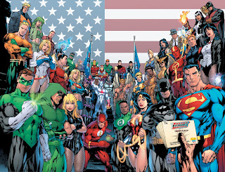
The Restructuring of DC

“It’s no secret that DC has myriad rich and untapped possibilities from its deep library of iconic and lesser-known characters.”
That understatement of the month comes from Alan Horn, President and COO of Warner Bros., in a statement released today that announces the restructuring of DC Comics. I don't think this necessarily means much for most of the comic book artists and writers working for DC, but it has major implications for future films based on DC characters. Read more about that here.
I see this as being reactionary to last week's news regarding Disney's acquisition of Marvel. Maybe the unintended side-effect of that acquisition will be to provide (as the slashfilm article speculates) a kick in the pants to DC movies, which have been few and have generally sucked (Christopher Nolan's uber-successful Batman movies notwithstanding).
And speaking of those Batman movies, word is that Nolan isn't really interested in making another Batman movie anytime soon, and shifting at the top isn't likely to bring him back into the fold, in my opinion.
Interesting to see how these things will shake out.
Thursday, September 3, 2009
Lobo to the Big Screen

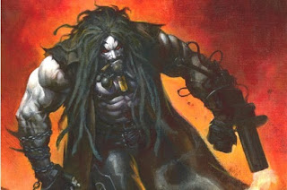
God, this is going to be a disaster of epic proportions.
I mean, I like Guy Ritchie movies as much as the next guy, but the script sounds awful, the studio wants it to be PG-13 (to be fair, a movie about an alien biker mercenary pretty much has 13-year-old mindset written all over it) and most importantly, no one who is not a comic geek has ever heard of him. If this actually makes it to the filming process with director and script intact, I'll eat my friggin' hat.
But just in case... actor speculation? Can we just assume it's Vinnie Jones?
But just in case... actor speculation? Can we just assume it's Vinnie Jones?
Tags:
13-year-old mindset,
DC,
disaster,
film,
Guy Ritchie,
Lobo,
mercenary biker,
Vinnie Jones
Wednesday, September 2, 2009
Anthropomorphism in "Maus"
"[... T]he cartoon (the Nazis are cats, the Jews mice), succeeds perfectly in shocking us out of any lingering sense of familiarity with the events described, approaching, as it does, the unspeakable through the diminutive." --Maus, front jacket flap.
Much was made about this quote in class on Monday, and although I agree with the general thrust of the statement, I disagree with the craft critique on how it creates this effect of defamiliarization. (quick note: according to google/firefox, defamiliarization isn't a word. but if demilitarization can be an acceptable term, then I feel comfortable with my neologism here).
My qualm is with the second part of that statement. What is the significance of the "diminutive" in Art Spiegelman's Maus? I'm not sure how much the effect of the diminutive really plays into my response to the novel. I think the surreality of talking animals enacting a holocaust narrative does more to scatter familiarity than the size of the characters. In fact, there's really no evidence that the characters in the novel are meant to be diminutive; they seem to live in normal-sized homes and use objects on a decidedly human scale. We don't see them frolicking amidst oversized lawn detritus a la Rick Moranis in "Honey, I Shrunk the Kids".

Perhaps the diminution is meant to refer to the size of events? But the size of events doesn't seem to me any smaller in Maus than in any other holocaust narrative. The approach of the novel, which addresses a major historic event by focusing on the life of a single individual during that event, is a pretty standard way to gain both intimacy and epic scope in both prose and film, such as Tim O'Brien's The Things They Carried or David Lean's Doctor Zhivago.
I think the universality of narrative that Hayden White discusses in “The Value of Narrativity in the Representation of Reality" trumps the problems of the diminutive in Maus. Although we may be accustomed to mice as these tiny little pests scurrying about our feet in dank and fetid places, we don't respond to those sorts of connotations or impulses much at all in the graphic novel, and if we do, they are tertiary to both the immediacy and familiarity of the war-survivor narrative (comforting fiction though it may be, Mr. White) and the other considerations raised by using animals as characters (such as the predatory dichotomy briefly discussed in class).
Subscribe to:
Comments (Atom)


